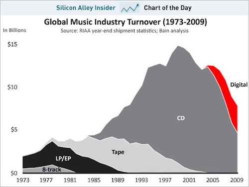
In February of 2011, a graph was making the rounds based on data attributed to Bain & Company showing a huge growth in the music industry peaking in about 2009 followed by a fairly sharp drop off. The graph was labeled as “Global Music Industry Turnover (1973 – 2009).
The graph, however, had a number of problems with it:
- It was about US sales, not global sales.
- It was not adjusted for inflation.
Because of these errors, it the graph hid some significant changes in the market over the 1980s, it understated the more recent declines in the music industry, and it made claims about the scope of the information that were flat out wrong.
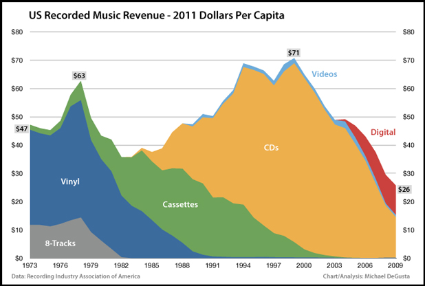
Tech journalist Michael DeGusta did some digging, looked at the original data, corrected it to reflect inflation-adjusted dollars, and found this:
The chart clearly shows a peak in music sales in about 1977, a sharp falloff until CDs grew in popularity in the 1990s, and then a second sharp fall with the rise of digital file sharing and downloads in the 2000s.
As a side note, blogger Matthew Yglesias also notes that this graph is only about the decline of the recording industry, not the music industry as a whole. While his comments are based on the original flawed graph, his arguments hold up just as solidly on the corrected version.
And this is why any time I see a graph or claims about what’s going on the media industry, I want to get the story behind the claim. This is a prime example of Truth 6:Activism and Analysis Are Not The Same Thing.


