This morning our Comm students at University of Nebraska at Kearney were fortunate enough to have a virtual class visit from Dr. Jan Boyles from the Greenlee School of Journalism and Communication at Iowa State University. She talked with us about some great data-driven stories and some exciting tools to use in telling these stories.
Here some data-driven stories:
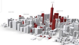
- Incredibly cool interactive 3D map of NYC.Why do UPS drivers only turn right?
A story documented by data – Left turns lead to increased fuel use and more accidents. - New York Times – Reshaping New York under 12 years of Bloomberg
Incredibly cool interactive 3D map of NYC.
- Pew Research Center’s Fact Tank
Presenting the news in the numbers. This week the data news is all about Pope Fancis’ visit to the United States. - Cornering America’s tri-points
This is more a mapping tech story than a data-driven story, but what-the-hey. It’s a story about the 65 spots around the United States where at least three states come together in one spot. You could do worse than using this map to plot out your next road trip. Bonus Link – a little e-book on the TriPoints.
And here are few tools you can use for your own stories.
- IBM’s Many Eyes / Watson Analytics
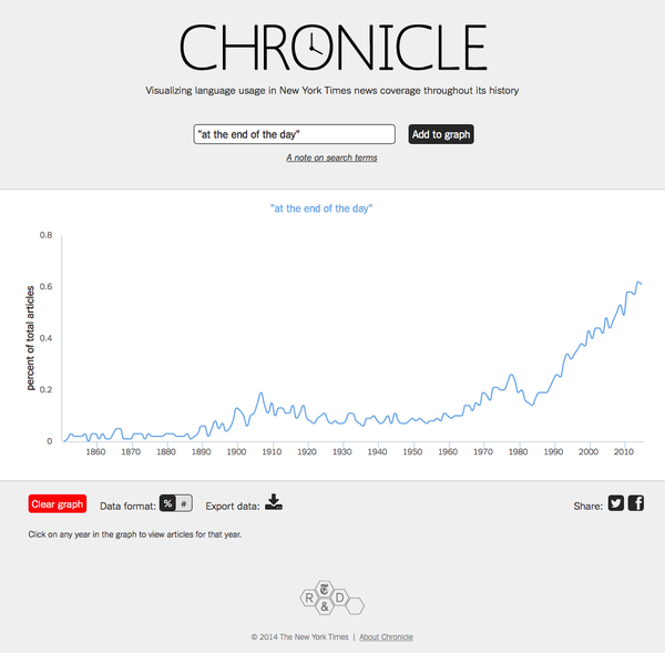
Many Eyes is a web community with expert guidance on how to best present your data. It is in the process of becoming IBM Watson Analytics - How often are words or phrases used in the New York Times?
The tool NYT Chronicle can let you know. Here’s an example of a search by Dr. David Baird

That pdf article about the tri-points is nothing but map porn. Thank you very much for a thoroughly interesting read.
I love map porn!